Unit 1: Project 5, Week 1
Unit 1: Project 4
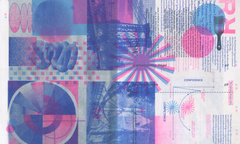
Unit 1: Project 3, Week 2
Final Crit Feedback & Response:
- How does the audience change? Would the original audience be interested in this format? What is the purpose, is it accessible?
- You can make any topic academic, ex. Gossip Girl and Justin Bieber academic studies.
- NFTs have made memes more valuable, this is reminiscent of NFT movement.
- This could be a coffee table book for sale.
- How would you communicate what the original was in the “final” book?
- You could push it to be more abstracted by illustrating the images.
- Material culture can signify value.
- You are memorializing throw-away culture.
- Challenging the medium changes the time.
My thoughts in response (also included in last slide above):
Reconfiguring the format of the People magazine changes the credibility, inherent value, longevity and audience. By designing the work in the format of a “high art” coffee table book I am (in practice) putting it on a pedestal by showcasing it as somewhat of an objet d’art, information worthy of documentation and memorialization. This new format, even with the exact same unedited articles, changes the audience. It becomes more difficult to access than the original format: it is obscured from its iconic branding and casual format, it has to be more expensive due to the materials it is made of, and its design language is ironic in its minimalistic Scandinavian grid layout. This is, intentionally, a far cry from the grocery store checkout counter.
There is a material culture, of coffee table books, that binding the same content in this elevated way gives the articles more credibility, longevity, and value. It documents this snapshot in time; it is now made a permanent, solid, and static reminder of everyday throw away pop culture during this slice of the year. When we reread it a year from now, five years, ten years how will we feel? How does knowing it will be around change our view of the article instead of scrolling past the headline on our phone? We give more respect to print and especially print in this high-quality format.
The translation of the format obscures the magazine from its original purpose and audience; this high art book has a position on the outside looking in on pop culture. There is humor as well as judgment, the valuation has a wink that could be interpreted as mockery due to its newfound inaccessibility.
Challenging the medium has been a learning experience for me and through this design translation process I’ve been thinking about media, the twenty-four hour news cycle, throwaway culture, gossip rags and the kindness and cruelty within them. The press can be incredibly cruel to those it splashes onto its pages for attention, clicks, eyes etc. that translate to advertising income. In many cases the subjects are extremely negatively affected in their reputation, safety, wellbeing, mental health and privacy. When it isn’t negative or unwanted attention then the subject and the paper can have a mutually beneficial relationship; but there are grey areas all throughout.
Due to the toxicity that is prevalent in these types of magazines, like People, I can’t say that I personally believe they should be elevated to this level and taken seriously. If this book were on your coffee table hopefully it could spur those conversations. I think the interesting part of the format change is the irony- how could you take news like this so seriously? I don’t think you need to.
“Great minds discuss ideas. Average minds discuss events. Small minds discuss people.” ― Henry Thomas Buckle
Unit 1: Project 3, Week 1
Unit 1 Project 2: Week 2
Feedback on my final crit:
- You could play with flipping the hierarchy so that the donor is the large focus and the candidate is the subscript.
- Talk about why you think you had trouble finding data pre-2000.
- You could flip the idea and make footnotes on the donor websites to show who they give money to, like Google who doesn’t shout it from the mountain tops.
- You could easily make these into real pins for future elections and hand them out to engage in real activism.
- You can now recategorize these again.
I intentionally designed them with variety so that the financials were denoted quite small in some and on par with the candidate in others to test how it felt to receive the information. I think the variety keeps it interesting.
I believe the reason why finding data on the candidates’ specific donors before 2000 is difficult is because the digitization of records has allowed sites like Open Secrets to easily track this information opposed to looking at paper copies. Additionally, rules and laws regarding campaign donations have changed over time on what needs to be reported and recorded. Also, there wasn’t as much money at stake previously (chart below) so it might not have been as high of a priority and felt like it didn’t need to be tracked and recorded heavily.
I reconfigure them with information that was invisible and changed the meaning of the buttons to now make that information visible. I recontextualized information that you can find if you look- so in a way I’m not sure what putting these in a certain new order would add to the better understanding of the political system. I could put them in scale to show who has had the most money but in the end I’m not sure that’s relevant with inflation and times changing plus then it could be hard to read the smaller candidates. I think it’s worth speaking about the change in the massive amount of money flooding in but I’m not sure that making the smaller ones illegible at scale would make the message clearer. But I will keep thinking on a way to make that work.
Unit 1: Project 2, Week 1
Project 1: Week 4
Project One: Week 4 Feedback
My notes on the feedback I received:
- Look into trend forecasting to see if this observation relates to how a trend forecaster works. Do they look to see what in unseen? Where the gaps are? Or do they look to see what a specific group is doing or not doing?
- Keep the observation going but get into even smaller niches, i.e. how does this type of bar, or nightclub, or coffeeshop, university, of more niche origin compare to others?
- Split the data by men and women, by age, by season.
- Retake data at different times of the year, i.e. would summer be brighter?
- Try to find old street footage to see how decades compare.
- This is an open-ended investigation that you could continue to collect data on forever.
My thoughts on the feedback:
The tips on further data tracking, to go deeper into tribes and spaces that are more likely to have a specific look, would be an improvement on the specificity of data collection. I didn’t keep track of age or gender in this project because it was purely observational and I don’t feel comfortable assuming what age and gender the passersby are- but I understand it could add greater knowledge to the data. Perhaps there is a version of this data collection that involves the community and people could volunteer that information for themselves. And as we talked about this data collection is entirely open-ended, I could continue adding to this data set forever, so I downloaded Tableau (data visualisation software) to explore because I think if I want to continue with this I’ll need a better system of organising and tracking the data. To follow up on feedback, like revisiting the spots in different seasons, would be best supported by a stronger organisational system.