Unit 3: Experiment 3, Broadsheet

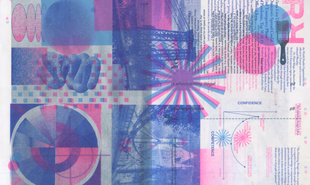
The third experiment, the Broadsheet, is a more traditional method of sharing information, not unlike a manifesto, through economically-made paper handouts. The design and form references newspaper editorial vernacular as a wink to the content and an acknowledgement of the long history of what is thought of as trustworthy journalism. The integration of digital layouts and examples onto print plays with the assumptions that are made about printed material, its greater credibility and authenticity, by subverting expectations of the print news vernacular. 


70 x 50 cm (open)
The Broadsheet is four pages, digitally printed on 55gsm newsprint from Newspaper Club. 

Unit 3: Experiment 2, Handheld Diagram

The information and annotations from the Board are converted into an interactive dimensional model in the Handheld Diagram. The Handheld Diagram visualises the opaque digital screen’s hyperlinks to visualise the concept of adding in additional layers of information through tactile examples. It references artists like Orna Feinstein in layering and David Batchelor in materiality. The Handheld Diagram seeks a similar kind of representation where the subject is abstracted and is conveyed in the layers building up the material and references the electric energy and complexity from the digital web as a nod to the cyberspace in which the subjects reside.

26 x 24 x 32 cm
The Handheld Diagram was made from acrylic sheets, which were laser cut and UV printed, placed into a CNC routed and glued (scrap) plywood base. 

The scale and dimension of this diagram stems from questions that developed in the first experiment. How can this content be understood without reading the entire article? Could the layering be expressed visually? Could it be less intimidating to interact with? Can we let systems be complex and multifaceted? The goal with this second experiment is to play with expressing the ideas distinctively to discover different ways people learn best.

Unit 3: Handheld Diagram Development

I researched materials and process for the UV printer so I could get a good idea of what it would look like to build layers on transparent acrylic.

First test on the UV printer

I came up with a few layouts for how the annotations would be stacked behind one another.

I also spent days trying to learn Rhino and then discovered it was totally unnecessary because the CNC router takes plain old Illustrator files.
Ready to be glued together
Laser cut the acrylic pieces (still has protective plastic on)
Slotted into place
And back to the UV printer!
The type in dark blue wasn’t legible through the acrylic- so had to wipe it down and reprint the red and pink slides in white ink.

Unit 3: Broadsheet Development

I was trying to cram a lot of information on one A3 and in my production surgery I was recommended Newspaper Club as a cost effective way to print at the scale of a broadsheet. It was an epiphany- I’ve been talking about news for a year, I should really just make a newspaper. The broadsheet iterations began.

With the extra space, I worked on layouts that would include my writing, citation information and had room for some of the examples I had brought up in my Unit 2 research presentation to really hit it home.

Testing typefaces and sizing for annotations
I felt my original yellow and blue color scheme was too dull and Guardian-esque without the vibrancy from the inkjet printer so I substituted the yellow for a brighter salmon. Color testing shown here.

Unit 3: Project 2 Becomes 2 Projects

During critique, I presented ideas for metaphorical sculptures and the group was left keeling like I had skipped a step. There should be another version of this information that was whole and encapsulated every element I was talking about that was one digestible piece. So the I started working on a booklet/handout version of the information as well as my original idea of a 3d acrylic sculpture that would be like a diagram for the concept of additional layers of information.

I first thought I could double-side print an A3 on the risograph and make a bunch for handouts at the grad show in June- and was thinking about different ways that could be laid out and folded up. Could the fold reveal something extra and create intrigue for people to want to open up the page?

Unit 3: Project 1 Process

The idea was to make the citations that I would hyperlink to physical interactive annotations. I explored paper engineering techniques to create a playful element I hoped people would want to engage with. I printed on wallpaper for the blues to get flexible papers and inkjet for the bright tennis-ball yellow acid color to create a more exciting reveal. I laser cut the back of the board, the handles for the draw downs and the feet for the base. Aligning everything so it matched perfectly to the visual design was key and added to to the time and attention paid to the paper mechanic designs, especially the dissolve effect.