Final Crit Feedback & Response:
- How does the audience change? Would the original audience be interested in this format? What is the purpose, is it accessible?
- You can make any topic academic, ex. Gossip Girl and Justin Bieber academic studies.
- NFTs have made memes more valuable, this is reminiscent of NFT movement.
- This could be a coffee table book for sale.
- How would you communicate what the original was in the “final” book?
- You could push it to be more abstracted by illustrating the images.
- Material culture can signify value.
- You are memorializing throw-away culture.
- Challenging the medium changes the time.
My thoughts in response (also included in last slide above):
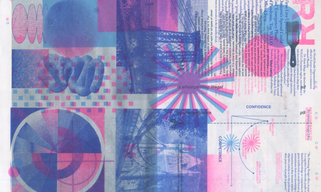
Reconfiguring the format of the People magazine changes the credibility, inherent value, longevity and audience. By designing the work in the format of a “high art” coffee table book I am (in practice) putting it on a pedestal by showcasing it as somewhat of an objet d’art, information worthy of documentation and memorialization. This new format, even with the exact same unedited articles, changes the audience. It becomes more difficult to access than the original format: it is obscured from its iconic branding and casual format, it has to be more expensive due to the materials it is made of, and its design language is ironic in its minimalistic Scandinavian grid layout. This is, intentionally, a far cry from the grocery store checkout counter.
There is a material culture, of coffee table books, that binding the same content in this elevated way gives the articles more credibility, longevity, and value. It documents this snapshot in time; it is now made a permanent, solid, and static reminder of everyday throw away pop culture during this slice of the year. When we reread it a year from now, five years, ten years how will we feel? How does knowing it will be around change our view of the article instead of scrolling past the headline on our phone? We give more respect to print and especially print in this high-quality format.
The translation of the format obscures the magazine from its original purpose and audience; this high art book has a position on the outside looking in on pop culture. There is humor as well as judgment, the valuation has a wink that could be interpreted as mockery due to its newfound inaccessibility.
Challenging the medium has been a learning experience for me and through this design translation process I’ve been thinking about media, the twenty-four hour news cycle, throwaway culture, gossip rags and the kindness and cruelty within them. The press can be incredibly cruel to those it splashes onto its pages for attention, clicks, eyes etc. that translate to advertising income. In many cases the subjects are extremely negatively affected in their reputation, safety, wellbeing, mental health and privacy. When it isn’t negative or unwanted attention then the subject and the paper can have a mutually beneficial relationship; but there are grey areas all throughout.
Due to the toxicity that is prevalent in these types of magazines, like People, I can’t say that I personally believe they should be elevated to this level and taken seriously. If this book were on your coffee table hopefully it could spur those conversations. I think the interesting part of the format change is the irony- how could you take news like this so seriously? I don’t think you need to.
“Great minds discuss ideas. Average minds discuss events. Small minds discuss people.” ― Henry Thomas Buckle